'%3e%3cpath%20class='a'%20d='M662.846,1043.8l-14.75-10.817-14.912,10.936a15.981,15.981,0,1,1,29.662-.119Z'%20transform='translate(-632.011%20-1022.02)'/%3e%3cpath%20class='b'%20d='M704.176,1354.583l13.291,9.865a16.179,16.179,0,0,1-26.706.112Z'%20transform='translate(-688.094%20-1339.553)'/%3e%3c/g%3e%3cg%20transform='translate(40.433)'%3e%3cpath%20class='a'%20d='M21.61-179.726a26.985,26.985,0,0,0-8.211-1.5c-7.4,0-11.8,4.757-11.8,12.382,0,4.106,2.509,6.256,5.539,6.256a8,8,0,0,0,5.507-2.281l.424,2.053h5.213Zm-7.234,3.519-1.6,7.722a4.593,4.593,0,0,1-2.411.782c-1.173,0-2.02-.749-2.02-2.444,0-3.389,1.6-6.191,4.79-6.191A8.418,8.418,0,0,1,14.377-176.207ZM38-168.583a14.118,14.118,0,0,1-5.7,1.238c-2.216,0-3.519-.88-3.519-2.444a4.5,4.5,0,0,1,.1-.815,15,15,0,0,0,3.975.554c3.812,0,7.266-1.629,7.266-6.028,0-2.7-2.151-5.148-6.745-5.148-7.331,0-11.469,5.735-11.469,11.8,0,5.507,3.877,7.038,8.635,7.038a25.253,25.253,0,0,0,6.908-1.043ZM29.267-173.7a3.587,3.587,0,0,1,3.324-3.226c1.173,0,1.6.587,1.6,1.238,0,1.271-.945,2.085-3.291,2.085C30.473-173.6,29.886-173.633,29.267-173.7Zm31.248-6.028a27.108,27.108,0,0,0-8.113-1.5c-7.592,0-11.991,4.953-11.991,12.414,0,4.334,2.607,6.223,5.572,6.223a8.258,8.258,0,0,0,5.6-2.281l-.1.815c-.326,2.737-2.542,3.486-4.985,3.486a22.6,22.6,0,0,1-6-1.01l-.978,4.985a31.974,31.974,0,0,0,6.843.847c5.441,0,9.775-1.792,10.948-7.69Zm-7.234,3.552-1.531,7.69a5.239,5.239,0,0,1-2.574.782c-1.173,0-2.02-.782-2.02-2.379,0-3.454,1.4-6.223,4.725-6.223A7.013,7.013,0,0,1,53.281-176.175Zm10.362-4.659-2.476,12.349c-.717,3.617.652,5.865,4.464,5.865a25.851,25.851,0,0,0,3.747-.293l.782-4.334c-2.281.033-2.542-.912-2.216-2.574l2.281-11.013Zm7.82,13.1-1.075,4.822a39.953,39.953,0,0,0,6.289.489c5.7,0,9.775-2.313,9.775-7.331,0-5.474-7.4-3.877-7.4-5.637,0-.652.619-1.14,2.607-1.14a23.311,23.311,0,0,1,4.79.554l1.108-4.659a29.486,29.486,0,0,0-5.735-.586c-4.985,0-9.58,2.118-9.58,7.136,0,5.311,7.4,3.78,7.4,5.409,0,1.108-1.173,1.5-2.867,1.5A29.214,29.214,0,0,1,71.463-167.735Z'%20transform='translate(-1.604%20187.383)'/%3e%3cpath%20class='b'%20d='M614.561-237.057h6.712l.945-4.79h-6.712Z'%20transform='translate(-552.294%20241.847)'/%3e%3c/g%3e%3c/svg%3e)
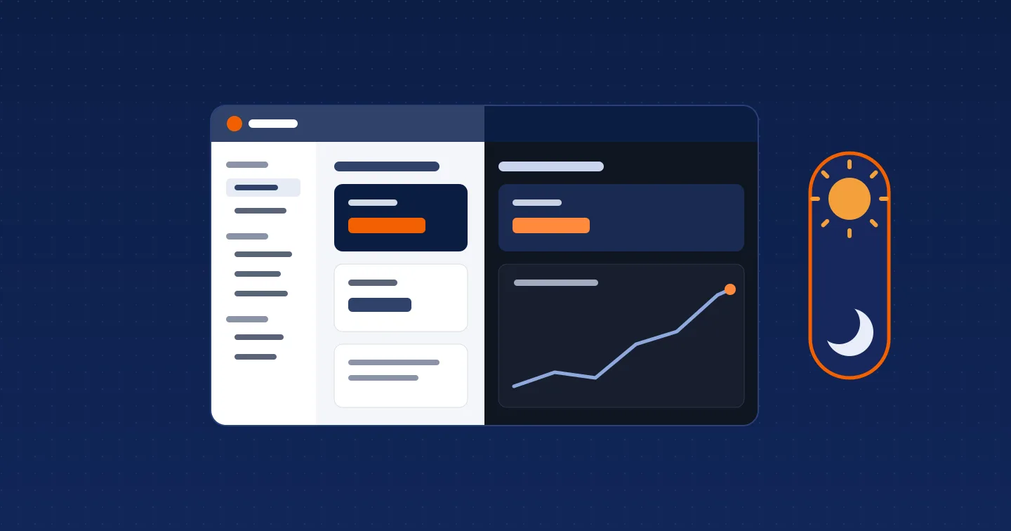
The Aegis app looks different this week. We redesigned it from the header down, added dark mode, regrouped the side menu and reworked how pages load. Nothing about how claims, payments or reviews work has changed. Your videos, settings and history are where you left them.
Here is what changed, and where to find it.
A new look
The public site, the app and your license page now share one design. The header is navy with the white Aegis logo. Orange is kept for the one main action on each page, such as Submit video, so the button you need is the one that stands out.
Pages share the same parts. A page starts with a breadcrumb, its title and a one-line description. Status pills pair a colored dot with a word, so Accepted or Pending reads the same whether or not you can tell the colors apart. Tables, cards and empty pages follow one style throughout.
Dark mode
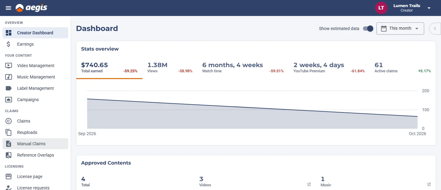
Aegis now has a dark theme. By default it follows your device, so if your phone or computer is set to dark, the app is too.
To choose for yourself, open the account menu at the top right and pick a Theme: System, Light or Dark. On a phone, the same setting is in the account block of the menu. The choice is saved on that device only, so you can keep dark on your phone and light on your work computer. It applies at once, without a reload.
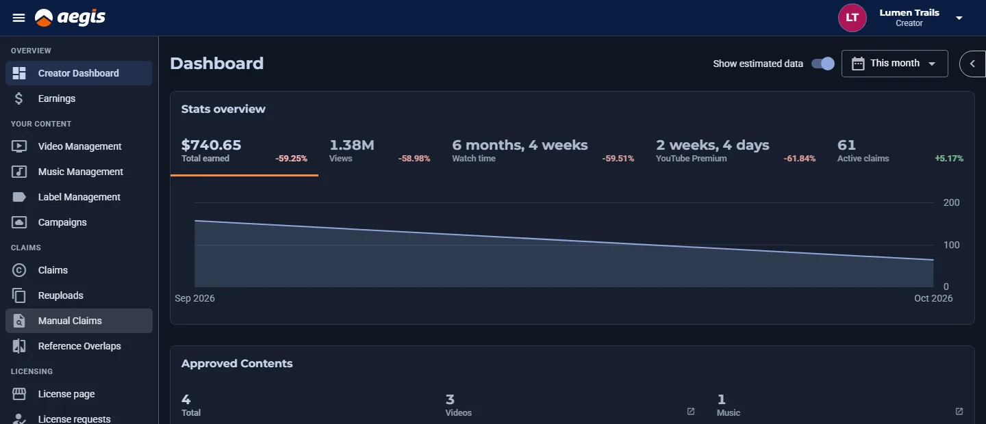
Your public license page follows each visitor's own device setting. If you picked an accent color, the page uses a lighter shade of it in dark mode so text stays readable, and the preview on the License page settings has a Light/Dark switch so you can check both. There is nothing to set.
This site, aegis.h.ki, follows your device's setting too.
Easier to find things
The side menu is now in groups:
- Overview. Creator Dashboard and Earnings.
- Your content. Video Management, Music Management, Label Management and Campaigns.
- Claims. Claims, Reuploads, Manual Claims and Reference Overlaps.
- Licensing. Your License page and License requests, if your account has them.
Agency owners also get a Your agency group for their creators. Who is using your content is listed as Reuploads, and every label fits on one line, so the menu keeps the same width on every page.
Clearer pages, and fewer blank screens
While a page loads, you now see its outline instead of an empty screen. If something fails to load, the page says so and offers Try again, instead of showing nothing or showing "No records found" when there are records.
The Creator Dashboard got the most work. Each section loads on its own, so one slow part no longer holds up the rest. If one section can't load, its own Try again reloads that section without touching the others. We also fixed the phone layout of Video Management and Music Management.
Added in the last few weeks
If you haven't looked around Aegis for a while, these are new:
- License pages. A public page where fans and reaction channels can ask to use your videos. See how license pages work.
- Who is using your content. A list of the channels your claims are on, with a weekly email. See Who is using your content.
- A check before you apply. Three questions at sign-up that tell you early if your content might not qualify. See the eligibility check.
- What Aegis has paid creators. The running total and how we count it, on Creators paid.
Tell us what you think
A redesign this size will have rough edges. If a page looks wrong in either theme, or you can't find something that used to be easy to reach, tell us through the contact form and say which page you were on. We read every message.
Open Aegis to see the new look.